
letterbox-4
Letters made of letters
Letterbox Turns Typography Into a Party Trick. The Question Is Whether That's Enough.
The Macro: Design Tools Have a Novelty Problem
Here’s the thing about the design tools market right now. It is enormous, growing fast, and absolutely drowning in products that do one clever thing and call it a platform. According to multiple market reports, AI-powered design tooling is sitting around $6 to $8 billion in 2025 and compounding at double-digit rates through the next decade. That sounds exciting until you realize most of that growth is consolidating around a handful of names, and the long tail of single-feature tools is getting harder to justify with each new Figma plugin or Canva update.
Which, look. That doesn’t mean small, focused tools are dead. It means they have to be genuinely good at their one thing.
The typography corner of design tools is interesting because it keeps getting invaded from both sides. Big generalist platforms like Picsart keep expanding their feature sets into areas like text-based creative work and visual content generation, and purpose-built tools for designers keep getting more serious. Meanwhile the gap between “I have an idea” and “I have a finished asset” has shrunk considerably, which raises the bar for anything trying to carve out a specific niche.
Typeface-driven design specifically has a pretty small but devoted audience. Motion designers, brand people, social media art directors, the kind of person who has opinions about kerning at a dinner party. Tools that serve them well tend to develop loyal followings. Tools that serve them okay get abandoned the moment something shinier shows up.
The competitor research here is, honestly, not very illuminating. I couldn’t find a direct rival doing exactly what Letterbox does, which is either a good sign or a sign that nobody thought the market was big enough to chase.
The Micro: Letters All the Way Down
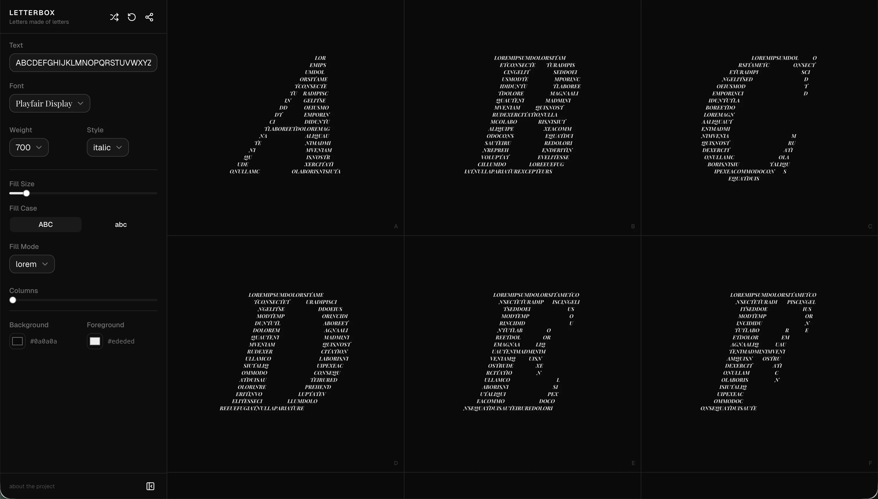
Letterbox does one thing. You pick a letter or a word. You pick a font. You pick your colors. And then the letter you chose gets filled in, rendered, constructed entirely out of smaller versions of that same letter repeated across the shape.
That’s it. That is the product.
And before you roll your eyes, let me tell you that when it works, it looks genuinely good. The concept, letters made of letters, is the kind of visual trick that feels fresh even though it’s been a staple of typographic illustration for decades. The fact that it’s now interactive and exportable in seconds rather than requiring someone to spend an afternoon in Illustrator is the actual value proposition here. Time to output is basically zero once you understand the controls.
The interface is minimal. Font selector, color inputs, and a live preview. I couldn’t find much detail from the scraped site content, which loaded a font and not much else, but from the product description it reads like the controls are simple by design. That’s a real choice. Soul 2.0 made a similar bet on restraint in its interface, and it works when the output is interesting enough to justify the simplicity.
Got solid traction on launch day, landing at number seven overall.
21 comments is a low number, though. That tells me people upvoted it because the demo was charming but didn’t feel compelled to talk about it much. That’s a subtle but meaningful signal.
The tagline, “letters made of letters,” is doing a lot of work. It’s a pun and a description simultaneously, which is actually pretty hard to pull off. Someone thought about that.
What I’d want to know is whether there are export options, whether it handles full words as elegantly as single characters, and whether the font library is broad enough to make repeat visits feel worthwhile. Those details aren’t confirmed, so I won’t guess.
The Verdict
Letterbox is a toy that might be a tool. I mean that as something between a compliment and a concern.
The output is legitimately useful for social graphics, presentation headers, custom lettering for small brands, the kind of thing a one-person studio needs to make fast. If the export quality is high and the font selection is real, this has a clear use case. The workflow is obviously fast. The concept is visually strong.
But here’s the thing. Design tools that do one trick need either a very large audience who needs that trick constantly, or a path to doing more tricks over time. I don’t know which direction Letterbox is planning to go. I don’t have founder information I can stand behind, and the product website didn’t give me much to work with beyond the core concept.
At 30 days, the question is whether people come back after the first use. At 60 days, whether there’s any kind of word-of-mouth among designers specifically, not just general-interest upvoters. At 90 days, whether the team has shipped anything that expands the use case or deepened the tool.
I’d use it again. I’m not sure I’d pay for it yet, and I’d want to know what they think this grows into. Aurorin CAD had a clear answer to that question from day one. Letterbox should probably get one too.